

Error messages are a crucial part of user experience in any application. Poorly written error messages can frustrate users, while well-crafted ones can guide them toward a solution efficiently. Here are key guidelines to ensure your error messages are effective and user-friendly.
1. Be Clear and Concise
Users should instantly understand the problem. Avoid vague or technical jargon. Instead of:
Error 404: Resource not found.
💡Use:
The page you’re looking for doesn’t exist. Check the URL or return to the homepage.
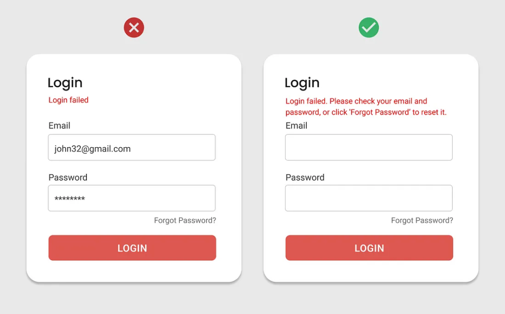
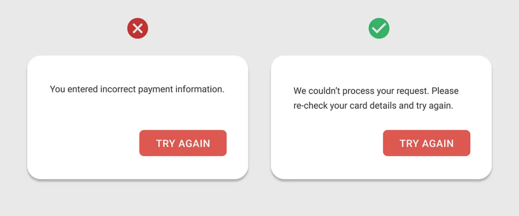
2. Explain the Issue and Provide Context
A good error message should state what went wrong and why. Instead of:
Login failed.
💡Use:
Your email or password is incorrect. Please try again.
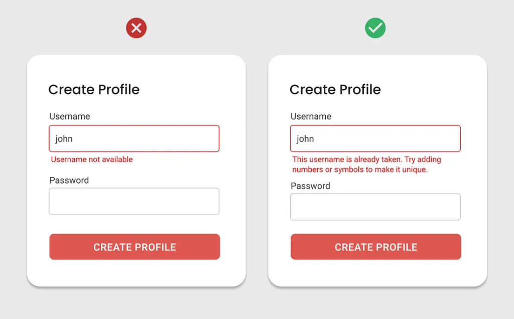
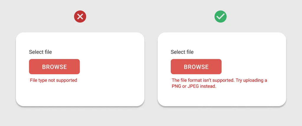
3. Offer a Solution or Next Steps
Help users recover from the error. Instead of:
File upload failed.
💡Use:
File upload failed. Ensure the file is under 5MB and in JPG or PNG format.
4. Use a Friendly and Professional Tone
Error messages should not be alarming or overly formal. Instead of:
Fatal Error! The system has encountered a critical issue.
💡Use:
Oops! Something went wrong. Please refresh the page and try again.
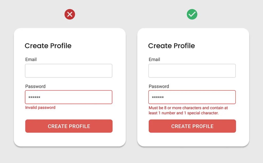
5. Highlight Critical Information
Use formatting to make key details stand out. For example:
📌Password must be at least 8 characters long and include a number.
6. Avoid Blaming the User
Errors should not make users feel at fault. Instead of:
You entered an invalid credit card number.
💡Use:
The credit card number you entered appears to be incorrect. Please check and try again.
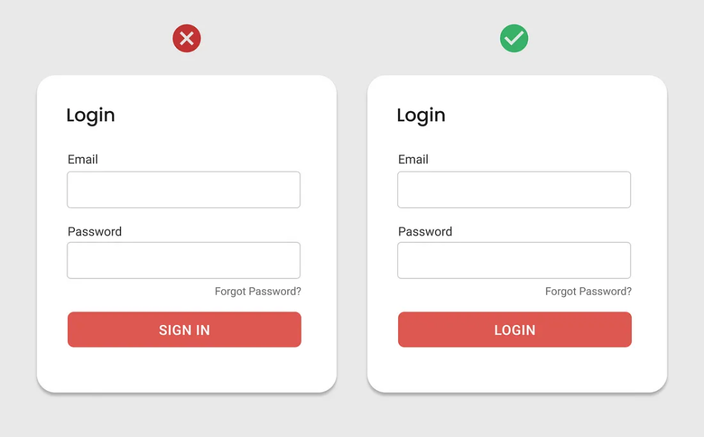
7. Ensure Consistency
Maintain a consistent tone and style across all error messages to create a cohesive user experience.
8. Log Errors for Developers
Ensure errors are logged in the backend to help developers diagnose issues without disrupting users.
By following these guidelines, you can create error messages that improve usability, reduce frustration, and enhance the overall user experience.
We are happy to help🤝


