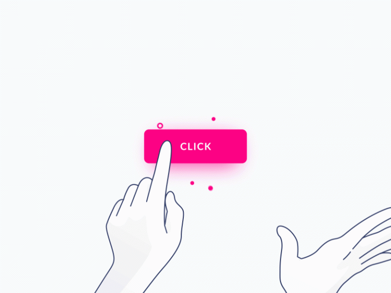

In the intricate world of user interfaces, buttons stand as the unsung heroes that bridge the gap between human interaction and digital functionality. From the humble beginnings of early computing to the sleek interfaces of modern applications, buttons have evolved to become an indispensable element of user experience. This article delves into the significance of buttons in user interfaces, exploring their history, design principles, and the impact they have on shaping user interactions.
Evolution of Buttons: Buttons have come a long way since the early days of computing when physical switches were used to trigger actions. With the advent of graphical user interfaces (GUIs), digital buttons became integral to navigating complex systems. The familiar ‘OK’ and ‘Cancel’ buttons were among the pioneers, simplifying user interactions and setting the stage for the interactive interfaces we know today.
Anatomy of a Button:
1. Visual Design:
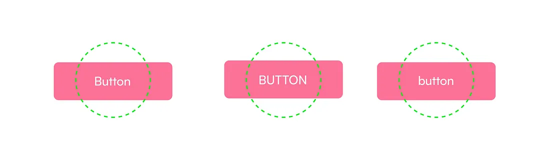
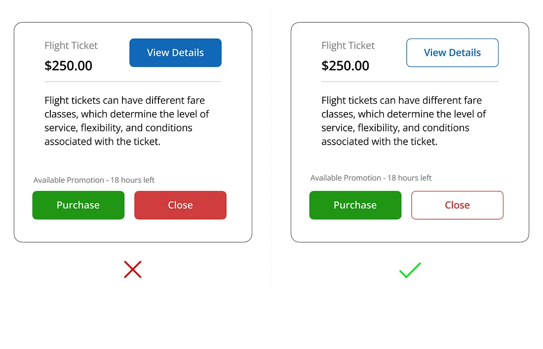
A well-designed button captures attention and communicates its functionality. The use of contrasting colors, shadows, and gradients helps users distinguish buttons from other elements on the interface. Consistent design across buttons fosters a sense of familiarity and usability.
2. Text and Icons:
Clear and concise labels, coupled with relevant icons, enhance the communicative power of buttons. Users should understand the action a button performs at a glance. Iconography can transcend language barriers, making interfaces more accessible to diverse user groups.
3. Size and Placement:
The size and placement of buttons play a crucial role in usability. Buttons should be appropriately sized for easy tapping or clicking, and their placement should follow logical flow, guiding users through the interface intuitively.
Types of Buttons:
1. Standard Buttons:
These are the everyday buttons that perform common actions such as ‘Submit,’ ‘Save,’ or ‘Close.’ They form the backbone of user interaction, enabling users to navigate through applications seamlessly.
2. Toggle Buttons:
Toggle buttons act as switches, changing states between ‘on’ and ‘off.’ They are commonly used for settings or options that users can enable or disable, providing a visual representation of the current state.
3. Floating Action Buttons (FAB):
FABs are prominent, circular buttons that typically house the primary action in an application. They are designed to stand out and provide users with a quick and easy way to perform a key function.
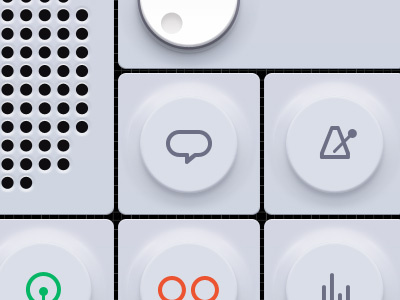
4. Icon Buttons:
Stripping away text, icon buttons rely solely on visual symbols to convey their purpose. They are useful for saving space and creating a clean, minimalist interface.
The Psychology of Buttons: Understanding user psychology is crucial in button design. Buttons should evoke a sense of affordance, indicating their interactive nature. Feedback, such as visual changes or subtle animations, reassures users that their action has been registered, fostering a positive user experience.
Challenges in Button Design:
1. Overcrowding:
Too many buttons can overwhelm users, leading to confusion and frustration. Prioritizing essential actions and using progressive disclosure techniques can help mitigate this challenge.
2. Accessibility:
Designing buttons that are accessible to users with disabilities is paramount. This includes considerations for color contrast, keyboard navigation, and providing alternative text for screen readers.
In the ever-evolving landscape of user interfaces, buttons remain a fundamental component that shapes the user experience. From their humble beginnings to their current sophisticated designs, buttons continue to simplify interactions and empower users in the digital realm. As technology advances, the role of buttons will likely evolve, but their essence as the tactile link between users and systems will endure, ensuring a seamless and intuitive user interface.
Fill-in the form below to reach out to us with your project👇


