

Dark mode has become a popular trend in user interface (UI) design, providing a visually appealing and comfortable experience for users, especially in low-light environments. However, designing a dark mode UI isn’t just about inverting colors; it requires thoughtful consideration of color schemes, contrast, accessibility, and user experience. One of the most crucial aspects of creating a dark mode UI is effectively organizing color variables and establishing a clear naming convention.
🌟Why Color Naming Matters
Avoid naming colors generically as “gray-100,” “gray-200,” “white,” or “black.” For instance, in light mode, “gray-100” might be the lightest gray, often close to white, and used for elements like a card’s background. However, in dark mode, the background of that same card should be a much darker gray, closer to black. Thus, naming the darkest gray “gray-100” in dark mode can cause confusion and inconsistencies. 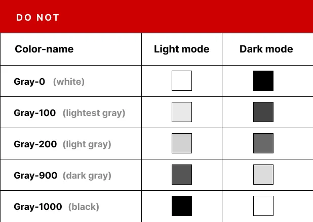
🌟Common Pitfalls in Color Naming
If you name the main background color “white” in light mode, but it turns black in dark mode, you can’t retain the name “white” for that element. Similarly, text colors that are black in light mode often turn white in dark mode, yet they shouldn’t be named “black” in both modes. 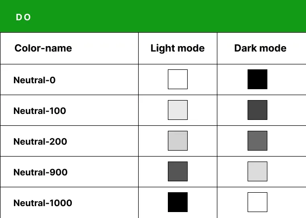
🌟A Better Approach to Naming Colors
A more effective method is to use neutral names like “NEUTRAL.” For example, “neutral-0” could represent a default color that adapts to both dark and light modes—absolute white in light mode and absolute black in dark mode. This approach avoids confusion and simplifies the process of creating adaptable color schemes. 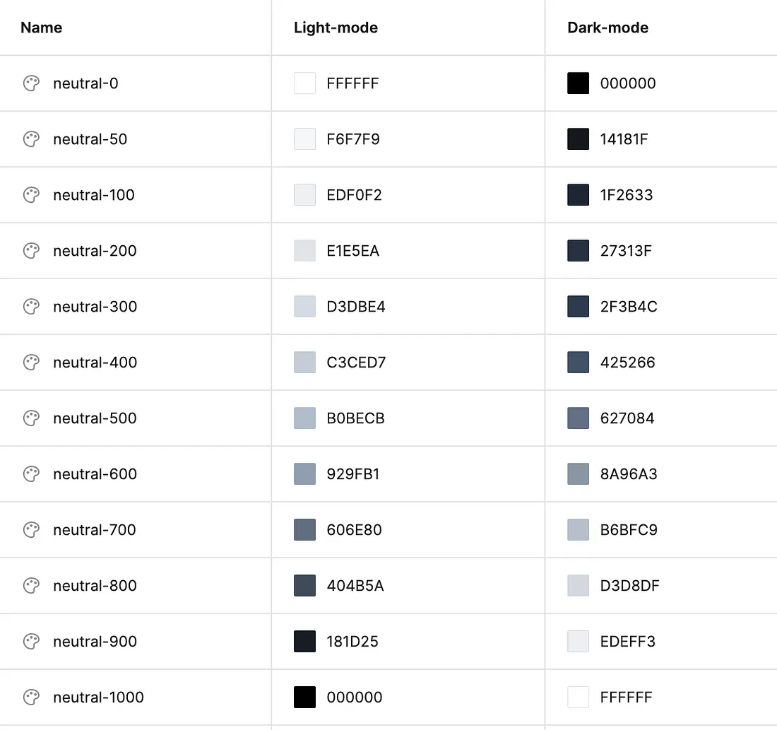
🌟Structuring Colors for Different Elements
Once you’ve defined your neutral colors, consider how they will be applied to various backgrounds. A basic UI might include a white background, a card, and black text. Switching to dark mode isn’t just a matter of inverting these colors to black backgrounds and white text. If your UI uses multiple shades of gray for backgrounds or includes elements like popovers, dropdowns, and cards, you shouldn’t just apply colors from the “neutral” palette without careful consideration. 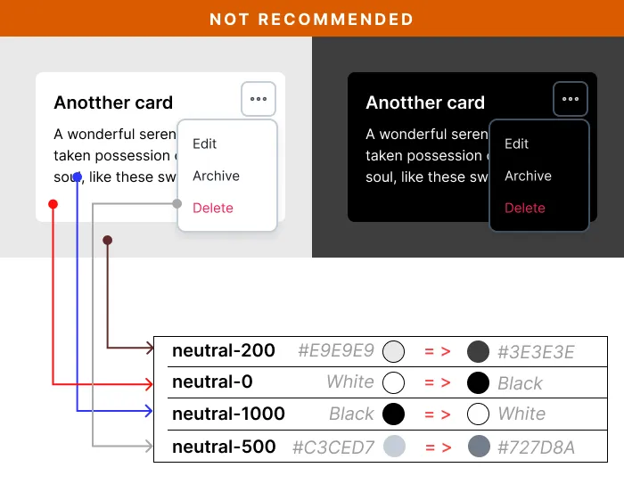
🌟A Better Strategy for Dark Mode
After establishing your neutral color palette, create another group for background colors (or surface colors) and assign your neutrals accordingly. Some designers create specific color variables for each element, like “background-dropdown-color” or “background-card.” However, this approach can become cumbersome, especially for complex UIs. Instead, use more generic names like “surface-base” for any background behind the main content or “surface-raised” for dropdowns, modal dialogs, or popovers. In light mode, these elements might all share the same white background but differ in the amount of shadow used. In dark mode, where shadows are ineffective, distinguish these elements with lighter shades of dark colors to maintain depth. 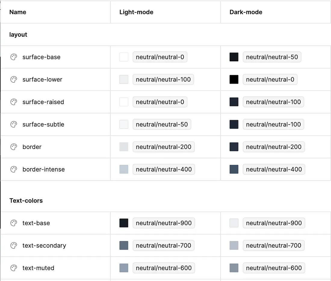
🌟Adjusting Other Colors for Dark Mode
When it comes to colors like blue, orange, or red in dark mode, don’t keep them identical to their light mode versions. Dark versions of primary colors should be created for both texts and backgrounds to ensure visibility and accessibility. For example, a “primary-soft” color might appear close to white in light mode but closer to black in dark mode. 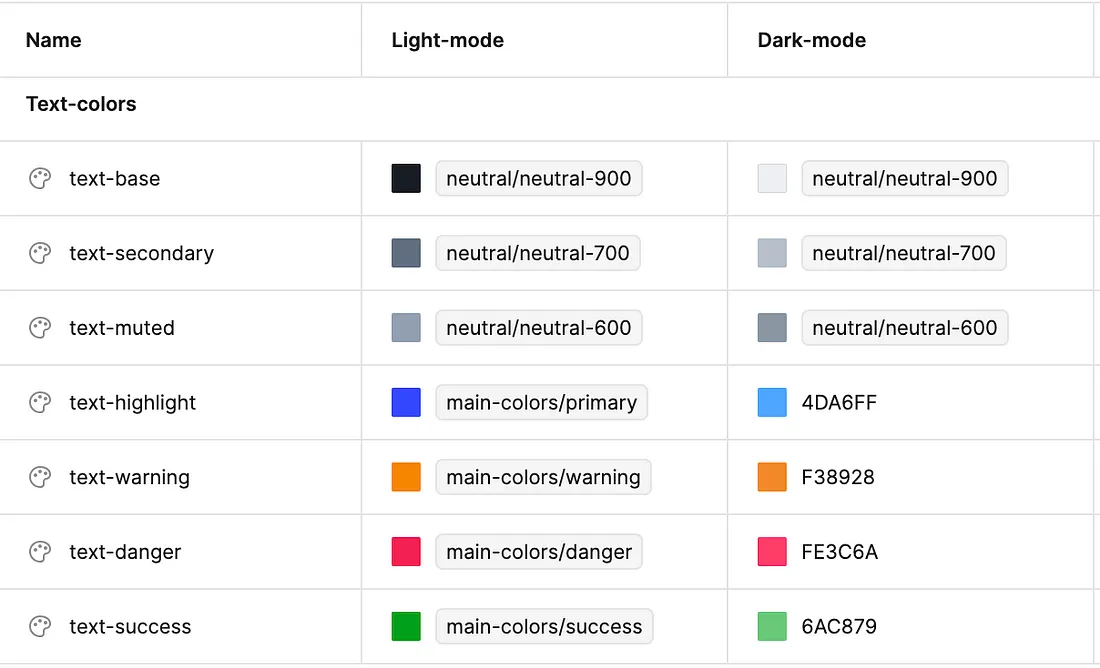
Developing the perfect color palette for both light and dark modes is a challenge, and different designers may have their own strategies. If you want to save time and ensure a polished, adaptable UI, consider using a design system that supports multiple color themes. This can greatly simplify the process of designing and developing stunning interfaces for any mode.
If you have any questions about the development of your site, contact us today 🚀🚀🚀


