

In a world bombarded by information, alerts play a crucial role in catching our attention and communicating important messages. From notifications on our smartphones to pop-up alerts on websites and applications, these visual cues serve as a means of informing, warning, or guiding users. However, not all alerts are created equal, and poorly designed ones can disrupt user experience rather than enhance it. To create effective and user-friendly alerts, designers need to consider various elements and principles.
1. Clarity and Brevity: Alerts should be concise and clear. Users shouldn’t have to spend time deciphering the message. Use simple language and focus on conveying the essential information. Consider the urgency of the message and tailor the wording accordingly.
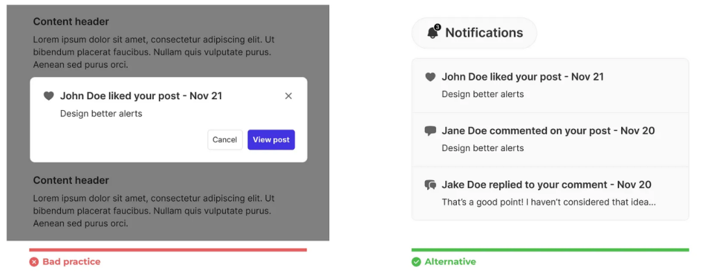
2. Visual Hierarchy: Utilize visual hierarchy to emphasize the importance of the alert. This can be achieved through size, color, contrast, or placement. Important alerts should stand out without overwhelming the user interface.
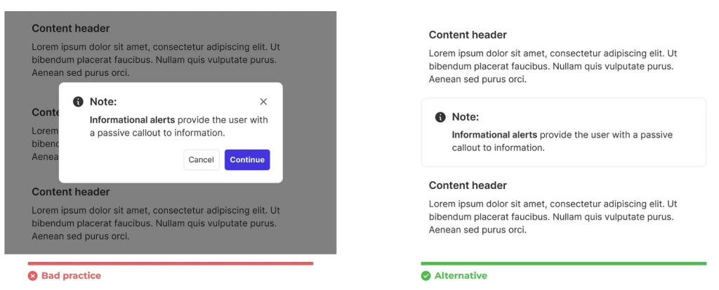
3. Context Sensitivity: Alerts should be context-aware. They should appear at appropriate times and in relevant situations. For instance, while using an application, an alert should pop up only when necessary, without interrupting the user’s flow.

4. User Control and Customization: Allow users to control their alert preferences whenever possible. Provide options to adjust the frequency or types of alerts they receive. Customization empowers users to tailor their experience according to their preferences.

5. Consistency in Design Language: Maintain consistency in the design of alerts across platforms and devices. Consistent design elements help users recognize and understand alerts more easily, fostering a sense of familiarity and usability.
6. Accessibility Considerations: Design alerts that are accessible to all users, including those with disabilities. Ensure adequate color contrast, provide text alternatives for visual content, and make sure alerts are compatible with assistive technologies.
7. User-Centered Approach: Understand the users’ needs and behaviors when designing alerts. Conduct user research, gather feedback, and iterate based on user insights. Tailoring alerts to meet users’ expectations enhances their overall experience.
8. Progressive Disclosure: Consider using progressive disclosure for less critical alerts. Start with a subtle notification that users can explore for more information if they choose. This prevents overwhelming users with unnecessary details.

9. Testing and Iteration: Test different alert designs and gather feedback through usability testing. Iteratively refine the alerts based on user responses and observations to continually improve their effectiveness.
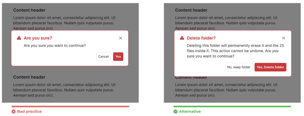
10. Error Prevention and Guidance: Design alerts that not only notify users of errors but also guide them on how to rectify or navigate the issue. Clear instructions or suggestions can prevent frustration and help users resolve issues efficiently.
The key to designing better alerts lies in finding the balance between catching the user’s attention and respecting their time and attention. An effective alert system enhances user experience by providing timely and relevant information while seamlessly integrating with the overall design. As technology continues to evolve, designers must stay adaptable and responsive to user needs, ensuring that alerts serve as helpful companions rather than intrusive interruptions in the user journey.
Happy coding https://skynix.co/🚀