

Success messages play a vital role in user experience. While we often focus on crafting helpful error messages, we shouldn’t overlook the importance of confirming positive actions. A well-designed success message reinforces user confidence and provides closure to their tasks.
A success message confirms that an action has been completed. Unlike error messages, these usually require no follow-up, so users often scan them quickly. That’s why clarity and brevity are key.
Short success messages are:
- Easier to read: Users instantly understand what happened.
- Less distracting: They don’t pull attention away from the interface.
- Clearer: Fewer words reduce ambiguity.
- More actionable: Users move on faster when messages are direct.
Common Mistake: Redundant Wording
One frequent mistake is over-explaining, especially with words like “successfully.”
Take this example:
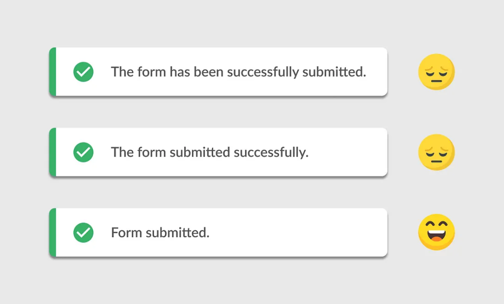
We’ve all seen it. But it’s unnecessarily wordy.
Here’s a cleaner version:
“The form submitted successfully.”
Still, we can go further. Why say “successfully” when the message itself implies success?
The best version:
“Form submitted.”
Short. Clear. Complete.
Even the article “The” is unnecessary. The user knows which form—they just submitted it. “Form submitted” delivers the message efficiently.
Guidelines for Writing Better Success Messages
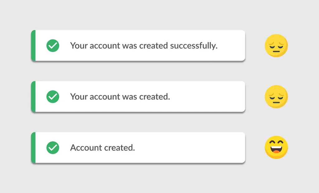
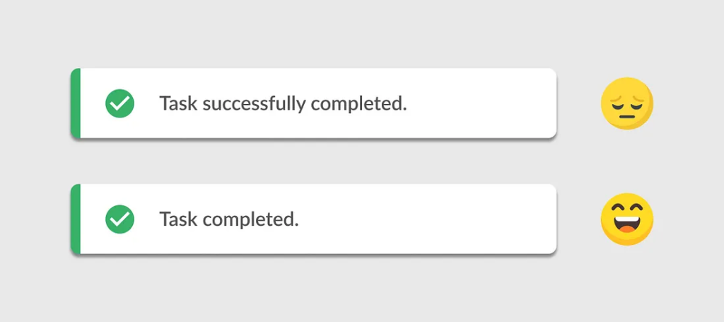
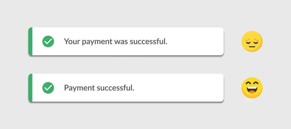
1. Eliminate unnecessary words
Skip fillers like “successfully,” “was,” or “has been.”
📌 Account created
📌 Task completed
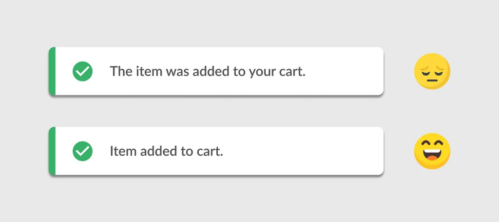
2. Lead with a verb or noun
Make it action-oriented.
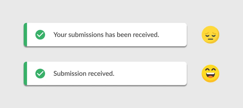
📌 Item added to cart
📌 Submission received
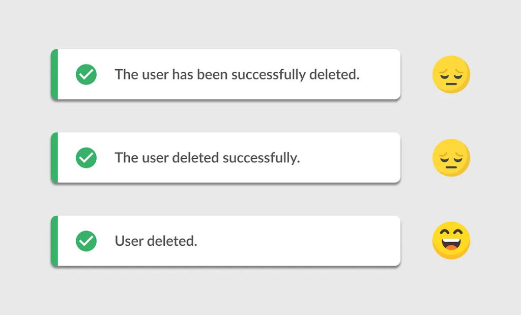
3. Drop articles (the, a, an)
They often add nothing.
📌 User deleted
4. Be direct and positive
📌Cut the fluff. Keep the tone optimistic.
Good UI writing is like good design: invisible. Success messages should be brief, clear, and informative—nothing more.
☝🏼Keep it short
☝🏼 Keep it clear
☝🏼 Keep it effective


