

Color is a powerful tool in UI (User Interface) design, capable of evoking emotions, setting the tone, and enhancing the user experience. Selecting the right colors for your UI is a critical aspect of creating an engaging and visually appealing interface. This guide will outline key principles and steps to help you make informed decisions when choosing colors for your UI design
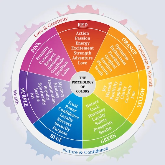
- Understand Color Psychology:
To choose the right colors for your UI, start by understanding color psychology. Different colors can evoke specific emotions and convey particular messages. For instance, blue often signifies trust and calmness, while red can evoke excitement or urgency. Research and align the desired emotional responses with your UI’s purpose.
- Consider Your Brand Identity:
Your UI colors should align with your brand’s identity, including its logo, website, and marketing materials. Consistency in colors helps in brand recognition and creates a cohesive and professional look. Choose colors that resonate with your brand’s values, message, and target audience.
- Utilize a Color Palette:
A well-organized color palette streamlines the design process and ensures visual harmony. A palette typically includes primary, secondary, and accent colors. Primary colors form the basis of your design, while secondary and accent colors complement and highlight key elements. Tools like Adobe Color, Coolors, or even manually selecting colors can help in creating a balanced palette.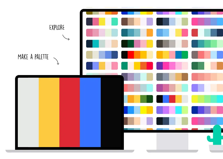
- Consider Accessibility:
Accessibility is crucial in UI design to ensure that all users, including those with visual impairments, can access and use the interface. Use a sufficient contrast ratio between text and background colors to enhance readability. Follow accessibility standards like the Web Content Accessibility Guidelines (WCAG) to create an inclusive design.
- Test for Color Contrast:
Test your chosen color combinations for adequate contrast. Low contrast can lead to difficulties in reading and navigating the UI, especially for users with vision impairments. Aim for a clear distinction between text and its background to enhance usability.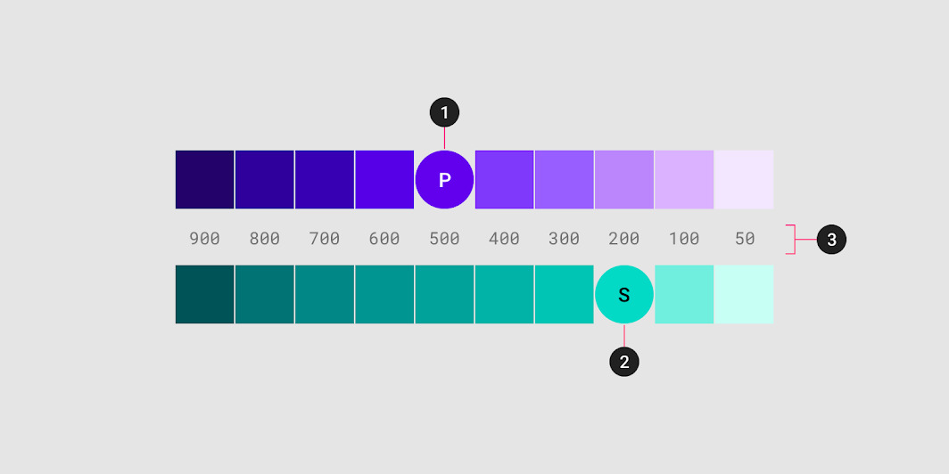
- Employ Color Hierarchy:
Establish a color hierarchy to guide users’ attention and emphasize important elements. Use brighter or more saturated colors for critical actions or elements you want users to notice immediately. Subdued colors can be used for less important or background elements.
- Consider Cultural and Regional Preferences:
Recognize that colors can have different meanings and interpretations in various cultures and regions. Be mindful of the cultural connotations associated with colors to ensure your design is well-received and understood globally.
- Gather Feedback and Iterate:
Collect feedback from users or stakeholders to evaluate the effectiveness of your color choices. Iterate and make adjustments based on feedback to enhance the overall user experience and optimize the color scheme.
Choosing the right colors for your UI design involves a thoughtful consideration of color psychology, brand identity, accessibility, and user feedback. By applying these principles and guidelines, you can create a visually appealing and effective user interface that resonates with your target audience and enhances the overall user experience.


