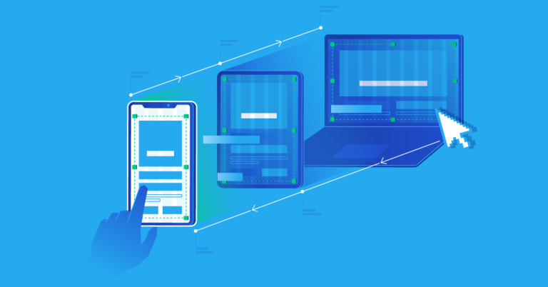

In today’s digital age, users access websites from a myriad of devices, ranging from small smartphones to large desktop monitors. Creating a seamless and enjoyable user experience across these devices is a key challenge for web developers. Responsive web design addresses this challenge by ensuring that web pages look and function well on all screen sizes. Here, we explore the best screen sizes for responsive web pages and how to effectively design for them.
Understanding Responsive Web Design
Responsive web design (RWD) is an approach that uses flexible layouts, flexible images, and CSS media queries to adapt the layout of a website to the viewing environment. The goal is to provide an optimal viewing experience—easy reading and navigation with minimal resizing, panning, and scrolling—across a wide range of devices.
Key Screen Sizes to Consider
While it’s impossible to design for every possible device, targeting a set of key screen sizes ensures that a web page looks good on most devices. These sizes can be grouped into several categories:
- Mobile Devices (Smartphones)
- Small (320px to 480px): Older smartphones and small screens.
- Medium (481px to 768px): Modern smartphones, including standard and larger devices like the iPhone SE and Google Pixel.
- Large (769px to 1024px): Phablets and small tablets, which often fall into the larger smartphone or small tablet category.
- Tablets
- Small (600px to 800px): Devices like the iPad Mini and other smaller tablets.
- Medium (801px to 1024px): Standard tablets, such as the iPad and Samsung Galaxy Tab.
- Large (1025px to 1280px): Larger tablets and devices that might be used in landscape mode.
- Laptops and Desktops
- Small (1024px to 1280px): Smaller laptops and some older desktop monitors.
- Medium (1281px to 1366px): The most common screen resolution for laptops and standard desktop monitors.
- Large (1367px and above): High-resolution monitors, including those used for gaming, design work, and other professional tasks.
- Large Screens and TVs
- Extra-Large (1920px and above): Wide screens and 4K monitors, often used in professional environments or for media consumption.
Designing for Responsiveness
To create a responsive web design, consider the following best practices:
➠ Fluid Grids: Use a flexible grid layout that can adapt to different screen sizes. Instead of fixed widths, use percentages or relative units like em or rem.
➠ Flexible Images: Ensure images scale properly within their containing elements. Use CSS properties like max-width: 100% to make images responsive.
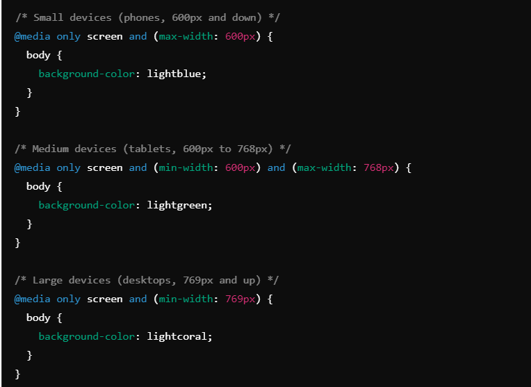
➠ Media Queries: CSS media queries allow you to apply different styles based on the screen size, orientation, and other properties. Here are some examples:
➠ Viewport Meta Tag: Include the viewport meta tag in your HTML to ensure proper scaling on mobile devices.

➠ Responsive Typography: Adjust font sizes and line heights based on the screen size to ensure readability on all devices.
➠ Testing and Iteration: Test your website on different devices and screen sizes. Tools like Chrome DevTools, responsive design testing websites, and real device testing are invaluable.
Designing responsive web pages involves careful consideration of various screen sizes and devices. By targeting key screen size categories—mobile devices, tablets, laptops, desktops, and large screens—you can ensure a consistent and user-friendly experience. Implementing fluid grids, flexible images, media queries, and responsive typography, and consistently testing your designs, are essential practices for effective responsive web design.
We are happy to help🤝


