


Web design is a constantly evolving field, with trends and best practices shifting alongside technological advancements and user expectations. However, some mistakes remain all too common, compromising user experience, accessibility, and site performance. Here are the top web design pitfalls to avoid in 2024 and beyond.
➥ Avoid Center-Aligned Text
While center-aligning text can look clean, it’s difficult to read, especially for longer paragraphs. The uneven starting points slow comprehension.
For better readability, stick to left-aligned text for important content.
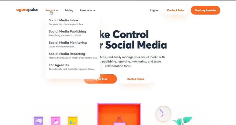
➥ Use Hover for Dropdown Menus
Requiring users to click to reveal dropdown menus adds unnecessary effort. Enable dropdowns to open on hover for smoother navigation.
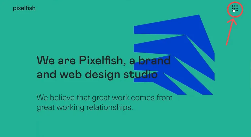
➥ Keep the Hamburger Icon Standard
Reinventing the hamburger icon often confuses users. Stick to the widely recognized design to maintain consistency and usability.
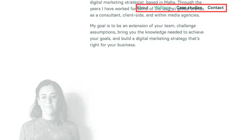
➥ Add Background Colors to Sticky Menus
Sticky menus without background colors can blend into the content, reducing visibility. Adding a background ensures easy navigation while scrolling.
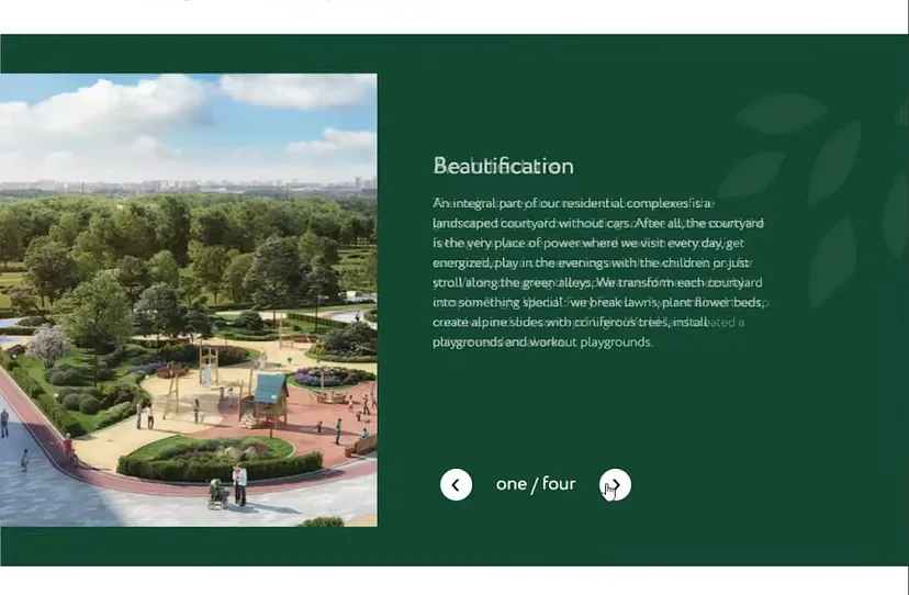
➥ Avoid Sliders
Sliders may look dynamic but are rarely effective. Most users don’t engage with more than the first two slides, causing crucial content to be overlooked.
Additionally, sliders can slow your site and distract from key messaging. Opt for static visuals that deliver your value clearly and quickly.
➥ Skip Justified Text
Justified text creates uneven spacing between words, making it harder to read—especially on smaller screens.
Left-aligned text provides a consistent, user-friendly reading experience.

➥ Keep Navigation Accessible
Hiding navigation behind dropdowns or clicks adds unnecessary steps. If your menu fits on one screen, display it upfront.
Accessible navigation improves usability, reduces frustration, and ensures visitors can find what they need effortlessly.

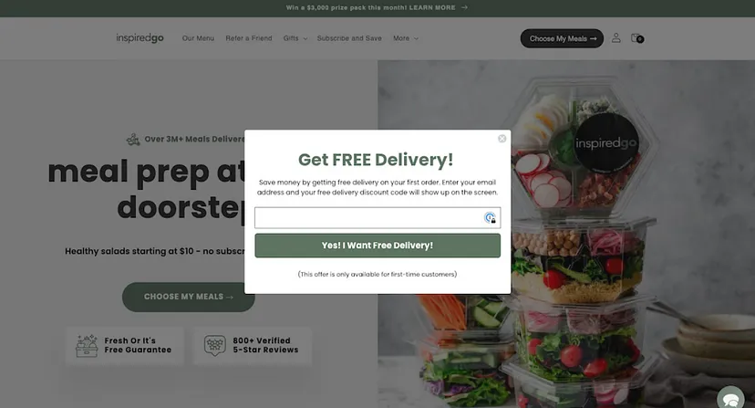
➥ Ditch Splash Pages
Splash pages delay users from accessing content, frustrate visitors, and hurt SEO. Instead, direct users straight to your main content to enhance engagement and conversions.
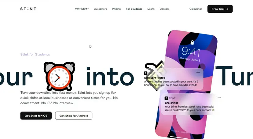
➥ Limit Emoji Use
While emojis can add a fun touch, overusing them risks making your website look unprofessional. Use them sparingly and focus on clean, brand-aligned visuals.
If you have any questions about your project, please write to us 🚀🚀🚀
We are happy to help🤝