

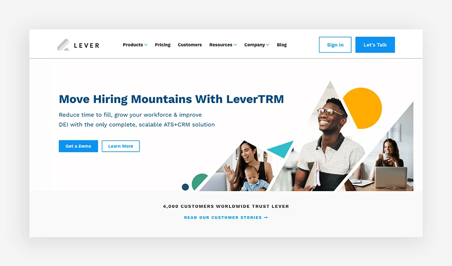
In the realm of digital interfaces, where user experience reigns supreme, there exist ghastly design errors that send shivers down the spines of users. From unnerving navigation to chilling visual choices, these haunting UI/UX mistakes turn what should be a pleasant interaction into a nightmare. Let’s uncover the bone-chilling design mishaps that strike terror into the hearts of users.
1. Poor Navigation: The Maze of Confusion

Picture this: a labyrinthine web of links leading users into the depths of confusion. Poorly designed navigation is the hallmark of horror in UX. Users stranded amidst convoluted menus and ambiguous labels feel like hapless explorers in a haunted house, desperately seeking an exit. A seamless, intuitive navigation system is the beacon of light that guides users through the digital darkness.
2. Petrifying Pop-Ups and Intrusive Ads

Imagine browsing a website, only to be ambushed by a legion of pop-ups and ads. This spine-chilling assault disrupts user flow and creates an experience reminiscent of a horror movie jump scare. Intrusive ads, like lurking specters, deter users from their purpose, driving them away in fear and frustration. A delicate balance between revenue generation and user experience is the silver bullet to evade this terrifying trap.
3. Cryptic Call-to-Actions: The Enigma of Buttons
In the cryptic world of call-to-action buttons, ambiguity reigns supreme. Buttons devoid of clarity are akin to hidden traps, leaving users wandering in a haunted forest, unsure of their next move. Vague or misleading CTAs lead to a hair-raising experience, where users are left questioning their actions and fearing the consequences of a wrong click.
4. The Curse of Slow Loading Times

A website plagued by the curse of slow loading times is a chilling specter that haunts user patience. As pages crawl to life, users are left in a state of agonizing suspense, grappling with the terror of abandonment. A speedy, responsive interface is the talisman against this dreadful curse, ensuring users remain engaged and undisturbed by loading nightmares.
5. Cluttered Design: The House of Horrors
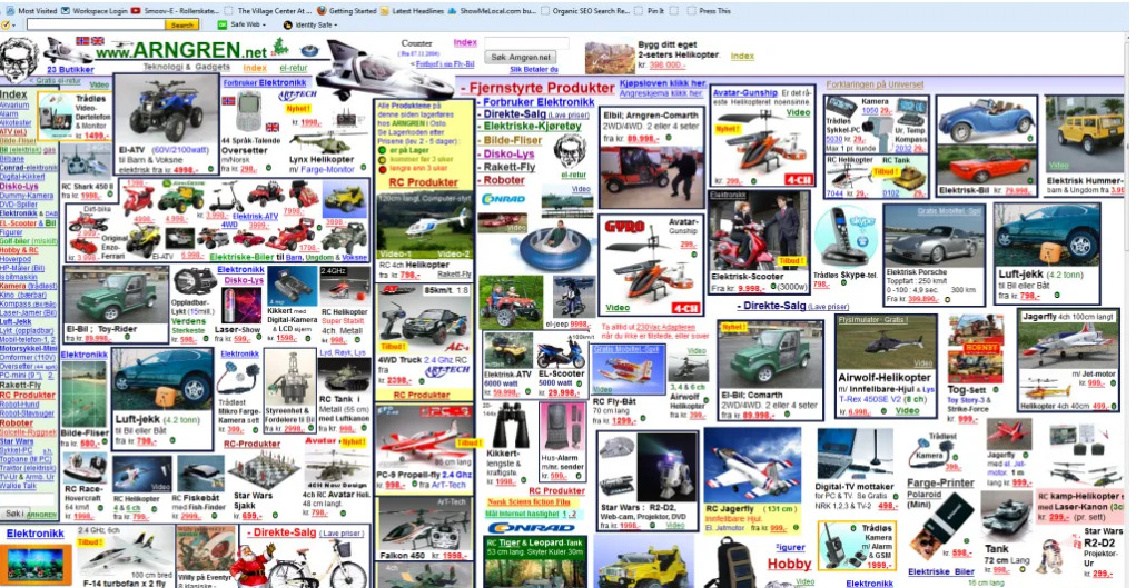
In the house of cluttered design, users find themselves lost amidst a cacophony of elements. A UI overloaded with information resembles a haunted mansion, where every corner hides a terrifying surprise. The absence of breathing room and visual hierarchy conjures a chilling atmosphere that overwhelms users, leaving them scrambling for respite.
6. Poor error handling
Ineffective error handling emerges as a hair-raising UI/UX design misstep, inducing user bewilderment, absence of direction, heightened user mistakes, data loss, inadequate error interception, emotional distress, erratic error messages, context voids, hurdles in accessibility, and erosion of user trust. To avert these chilling outcomes, furnish lucid, succinct error messages elucidating issues and proposing remedies. Employ rigorous testing and user input to fine-tune error management systems, emphasizing error prevention. Implementing robust error handling mechanisms elevates user experience, fostering heightened satisfaction among users.
7. Lack of user research

Neglecting user research stands as a critical misstep in UI/UX design, fostering inadequate comprehension of users, flawed personas, disjointed user pathways, misguided presumptions, and squandered chances for creativity. This lapse further manifests as a deficit in empathy, suboptimal information structuring, constrained usability trials, inefficient feature ranking, and a forfeited edge in the market. Steering clear of this daunting error necessitates an investment in thorough user research, empowering a profound grasp of your audience. This, in turn, paves the way for crafting a design that revolves around users’ requisites and anticipations, ensuring a user-centric approach.
In the world of UI/UX design, steering clear of these bone-chilling mistakes is pivotal. A user-centric approach, where empathy meets functionality, can exorcise these haunting specters from the realm of user experiences. By embracing intuitive navigation, respecting user time, providing clarity in design, and ensuring accessibility for all, designers can ward off these terrifying UI/UX mistakes and create delightful digital experiences.
Remember, in the eerie landscape of user interfaces, the true horror lies not in the dark corners but in the design missteps that haunt the user journey. From cryptic buttons to the haunting abyss of inaccessible design, these eerie errors can certainly make for a spine-chilling user experience.
Fill-in the form below to reach out to us with your project👇


